I wanted to do a tutorial on colour correction but when I started this I realised there are so many ways you can do colour correction that I might as well work though some of the adjustment layers and allow you to apply them to your work and combine them so this is the first of a set of tutorials devoted the Adjustment Layers.
How to find the Adjustment Layers

There are several ways you can access the adjustment layers and depending on which version of photoshop you use it will differ and the panels will differ slightly I’m using photoshop cs5
First way you can access adjustment layers is by going to the menu bar at the top of your window and clicking on Image > Adjustments
The next way to access it is at the bottom of your layers palette, the icon of a circle cut into two and coloured black and white is the logo for adjustment layers.
The third way is for the CS4 and CS5 users and only if you have set up your workspace this way you can create quick links and put them anywhere I’ve stuck mine next to my layers palette so its easy access.
Now we know where they are lets start using them.
Ajustment Layers: Levels Palette
For this tutorial a pretty simple one, the Levels palette, with Levels you can modify the highlights, shadows, midtones and you can also target your basic RGB and improve your primary colours within your images. First get your photo, I like to always work with large images simply becuase its easier to reduce images to the size you want than increase them, so you will need to find a great gallery with lots of high quality images such as one of my all time favourite galleries Pretty as a Picture run by Dana of Chosen Art. I’ve chosen an old Buffy season one photo as a lot of the old Buffy images are quite dark and have a lot of mood lighting already applied to it, and with this tutorial I’ll try and show you how to create your own mood lighting.

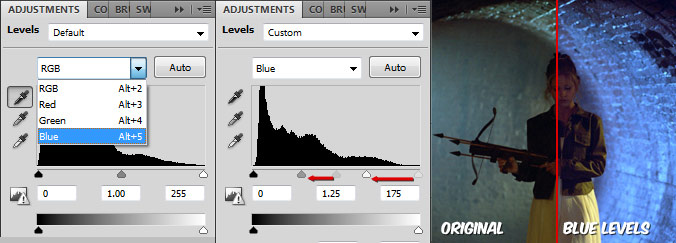
Okay so first things first lets see what the Levels palette actually looks like and what’s on it.

Preset Levels: these are defaults set by Adobe for easy and quick modifications generally these are very slight changes like brining out the highlights or darkening the shadows.
Colour Targeting: this dropdown allows you to target RGB which for the newbies means Red, Green and Blue those are your basic primary colours when it comes to digital images, and before anyone says primary colours are Red, Yellow and Blue, that is for things like paint and colours, RGB primary colours are for anything to do with light and everything digital are displayed on monitors or projects which use light rather than actual colours. To modify all the colours without actually giving priority to a single colour use the RGB option.
Image Level Chart: this is a histogram of the exposure levels on your image on your left side you have the shadows and on the right you have the highlights as you can see the image I chose is quite dark so it has more pixel density on the left hand side telling us that it is a dark image, and if the image was over exposed there would be more on the right hand side.
Under the chart you have your points which are adjustable and moving them along the histogram to increase or reduce the depth of the selected point.
Shadow/Brightness: I don’t generally use this tool as it simply adjusts the amount of darkness and brightness in the image I much prefer to target specific areas… therefore I don’t know much about this tool so I’m not going to go into it in this tutorial.
Lets begin the tutorial by modifying a colour within the image. There are two main colours in this image, Blue, and Yellow so lets play on those colours and try and give this a eerie blue mood.

First select the colour targeting dropdown and select blue this give you a new histogram which represents the amount of blue in your image if we move the highlights and the midtones up the scale a bit we can change the turquoise blue to a much deeper blue and you can also see that her dress has turned a bit more blue even though there wasn’t much blue in there anyway this is becuase we are changing the highlights and there will have been a small bit of blue tone within the yellow. [click the image to see a full size colour comparison between the original and our amendments.]
Now we have a blue image, we can also use this method to remove the blue from the image.

By moving all the points towards the other end of the scale we can almost completely remove any of the blue within the image this is a great way of quickly adjusting an odd unwanted colour in a picture.
With the levels palette you can combine the different colour targets together to create a new tone to the image. If you now use the colour target dropdown and select Red we can add some red to the image, there wasn’t much red in the image to begin with so this will be a good example of how levels creates colour from the colour that is already present in the image. If you repeat the same sort of action we did to bring out the blue in the image we can convert some of the yellow/green images to an orangey feel [click image below for a full preview of green to orange photo]

However personally I prefer to use the levels tool to keep most of the colours as they are but bring out their natural colours to make things stand out more such as the brightness of the image, the easiest thing to use it the RGB setting as this will not modify the colours already set in the photo. So let’s delete that adjustment layer and start afresh. (a good note about adjustment layers are the fact they are independent from the actual photo which means you can adjust the image with out actually affecting the image so if you decided you don’t like something you don’t have to start again this helps when you start using more than one adjustment layer.)

Okay so I’ve lightened the image a bit reducing the amount of shadows by moving the highlights points up the scale and I’ve also soften the shadow, in the general colours by moving the midtones point up the scale. I wanted to keep my shadows black however so I’ve moved the shadow point down the scale a bit
And there we go, your basic adjustment layers palette. View the final outcome of the tutorial or click on the image in this post to view a larger version of the comparisons