All posts by Dee

My name is Dee, I'm a Web Design. I've been into digital design since I was about 14, and I'm mostly self taught, my passion was started with creating Fan Art and Elucidation Art has been my Fan Art home since 2000 and has had many changes in that time, and will forever be changing, so I hope you stick around to find out whats next in store for Elucidation Art...

Design Decisions

Oh man, I’ve had last week off work and I worked really hard on a new layout for elucidation art, but you know what!!! I don’t like it now. it took me ages to decided on a design idea I was going to go with a cross over of True Blood and Ats because lets face it True Blood has lots of BtVS and AtS links, biggest one being gorgeous blonde human, and gorgeous brunette vampire so I took those two from each of the shows, Sookie and Angel, they make a really nice couple. But I’m not sure on the design, I think the only way to go is to create a new one and just create the Sookie and Angel background I was using as a wallpaper for the gallery.

Don’t you just hate it when you work so long on something you really like and then you look at it too long you begin to not like it even before you’ve finished the damn thing lol.

Also Special thanks to Dana for the Halloween pic

I’ve added a few items to the gallery you can get to them here via the thumbnails
One True Blood text, and one Angel True Blood Cross over

    Browser Combatibility AKA I HATE IE 6

    the bane of many designers life the fact that a large percent of people are still using outdated software to browse the internet such as ie6. In fact the majority of the people browsing my site use IE6 I use a stats program to keep in touch with what people are viewing on my site so I can at some point put that to good use and do something with my site that will help people view elucidation-art with more ease.
    Continue reading Browser Combatibility AKA I HATE IE 6

    Learning More on SEO

    I know I said I would update more frequently, I’ve just started work on a new site for my mum which will hold me back from updating here, but its using the same system as what I use here so anything i find out for them i can implement it here, so its a great way of researching elucidation art, although I do already have a long list of things I want to add here anyway. I have also decided to buy a new domain name for my portfolio site, as I already have twilight-fuse.com with my partner in crime Keeper I am going to devise a whole fuse network. but I wont be getting rid of elucidation. I would love to just be able to buy elucidation.com or elucidation.co.uk. but its not that easy.

    I’ve also been looking into SEO, (Search engine optimization) I know hardly anything about it. does anyone know any good sites, and good tips about SEO I would love to hear them and anything I find out I will share here. although SEO sounds so boring lol not as good as doing fanart, but to get fanart viewed kinda need to know SEO. and I do love working on layouts and I didn’t realize how much the way you code your site effects how search engines view your site. so be warned if you are like me and know nothing about SEO do a search and find out if anything you are doing is preventing you from being searched properly. I’ve found a few things, which is one of the things I’m going to be changing along the way with Elucidation.

    so please comment I would love to hear about any tips and tricks you might have. thanks

    Illustrator Icons

    just a quick note, today I’ve been making icons at the company I work at, in Illustrator no less, I’m really poor at Illustrator but I’m getting better, and I’ve loved making icons I think they look pretty cool but to anyone out there that thinks they would like to do icons, and I highly recommend you do its well fun and you can be as creative as you like. just remember do them in a square!!! I’ve just done a butt load of icons and they are all different sizes and they have to fit  a 48×48 square…  probably all reading thing going Duh!!! I just didn’t think so if you wanna do icons make sure you do it in a square canvas. And I’ll try to remember too. lol

    ETA: I’d also like to say welcome to my new affiliate AnMarie at Never Say Goodbye go check out her site its got some fantastic art work on there.

    Growing and Expanding

    Just a quick update as I’m on my break at work, I was just wondering what people thought to adverts on sites, I’ve found a nice site that does affiliate programs that don’t look horrible. Personally I hate adverts, but these ones when I first saw them I thought they were just links put up by the host but it seems its a huge affiliates program that people get paid for, so I was wondering if anyone reading this had any major problems with it, cause I wouldn’t put any up if no one liked them not that I get major traffic but I want to keep the traffic I do get.

    This is the site that I found the affiliate program on they look really well designed, and you can get specific links that are similar to your own site categories, Also it is my favourite site and I read it daily!!! so please check it out. PSD TUTS Its an Amazing site. and here is the link to the affiliate program Buy Sell Ads Just in case anyone wishes to add it to their site and make a few extra bob lol.

    Also I’ve been looking into getting personalized icons for members cause at the moment its just that little blank person on the comments which looks kinda boring. but I’m going to work on that at the weekend.

    Yes I’m Still Alive

    Hey everyone, if your still reading this, thank you so much, I am still here, and although nothing has changed yet again, my life has been taking a step forward or 30 lol, I recently got a new job as a website designer, been at it a few months now so its been pretty hectic getting into the swing of commercial design but getting there, I have some big plans for elucidation I’ve learnt a lot about wordpress which is what i use to blog here, and I was thinking of making this site back into a design blog rather than a general one, as this site was originally meant to be a tutorial site only not a gallery of my work, however that does take time so gonna be difficult getting things into gear however New Year and all I have plenty of New Year Resolutions.

    1. Redesign Elucidation.
    2. Update once every two weeks at least.
    3. Get my portfolio up and running.
    4. Redesign the Fanlistings :s been a long time coming.
    5. Get Twilight Fuse up and running to host people on this server
    6. And get Elucidation to be as Big and useful as possible.

    Not neccesarily in that order mind you but I wanna get all that done, and continued. gonna need to get back into forums again, I’ve become a bit of a recluse of late… well in the last two years :s but with uni over I gotta get out there and start enjoying the internet again.

    So an Update! just a small one for starters is.
    Midnight Tears Link has been updated. and also Happy Xmas and a Better New Year to you all.

    Dee

    Basic Blending in Photoshop

    In this tutorial I will talk about blending image together to create a seamless effect for any kind of image and fanart that is easy to use for anyone one from beginners and advanced users alike. This tutorial shows you two methods of blending that work perfectly on their own or used together to create an advanced level of blending.

    First Part to BOTH Methods

    [singlepic=3]

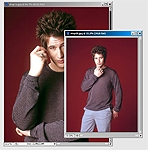
    OK so lets start, firstly pick your images, I like to use large images that way you can minimize them and sharpen then, if you use smaller images you loose quality when you enlarge them. I have chosen two pictures of Brendan Fehr star of Roswell. if you want to use these images to test out this tutorial or you like Brendan Fehr you can get them from these links Image One || Image Two

    [singlepic=7,188,150]

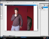
    Create a New canvas any size, I tend to use wallpaper sizes 1024×768 or 1280×1024 it gives you a large area to work with an you can always crop it later. Copy and paste both images into the same canvas and arrange them where you like. (as you know Photoshop uses layers so when you copy and paste the images onto the canvas they’ll be separate layers this is good as you’ll see later.

    [singlepic=17]

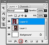
    Now look at your Layer pallet that can be found on the right hand side of your workspace, if you look at the bottom of that pallet you will see a square with a white circle, this is the layer mask button. A layer mask basically allows you to control different areas of the present area in this instance it will help us to control the opacity of certain areas of the images.

    [singlepic=11]

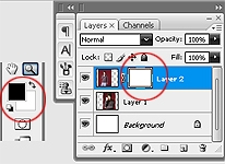
    Once you press the layer mask button you should notice that a white box has appeared next to your selected layer and also your colour pallet (on the left hand side of your workspace) ha changed to black and white. This is because the layer mask relyes on the black and white tones to tell it weather to delete or show the areas. Black = 0% opacity (Delete) white = 100% opacity (Show)

    Method One

    [singlepic=12]

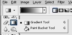
    Ok now onto the first method. With this one we are going to use the gradient tool, you have to make sure that the colours don’t change from black and white. Using this method is the easiest way to create a smooth fade, it is best to use this method if want a gradual fade.

    [singlepic=13,188,150]

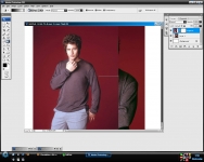
    Now that you have your gradient tool selected click and drag your cursor across the area you want to fade. (remember that black means hide. if you suddenly find you’ve deleted the the side you want to keep just reverse the direction you drag your cursor. )

    [singlepic=14,188,150]

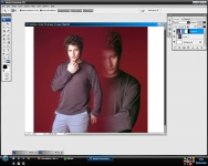
    This is how it looks with a gradual fade, this is just the first time you can repeat this several times to get it the right way, but notice how even the fade is on the images, this is useful if you want to blend images rather than manipulate images to make them look like they are the same image.

    [singlepic=15]

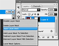
    To repeat this action you will need to finalize each action, you can do this by right clicking on the gray box next to the selected layer (in the layer pallet) and select “Apply Layer Mask” then repeat the layer mask and the gradient drag to create a new fade on the image.

    [singlepic=16,188,150,]

    once you repeat the action a few more times you could come up with something a bit like this, however this is just a quick example, if you spend more time over your placement of the gradients you can make it seamless.

    Method Two

    [singlepic=8]

    Ok now onto the next method, in this way we are going to use the paintbrush tool. Select the paintbrush remembering that black means delete and white means show, you can also change the opacity on the paintbrush by looking at the options tool bar found at the top of your workspace, by changing the opacity you can get a gradual fade, you can also use different styles of brushes, as long as you remember black means delete and white means show.

    [singlepic=9]

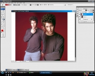
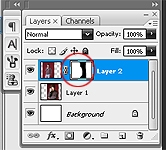
    So paint over the area you don’t want to keep, and if you look at the layer pallet again it should look similar to this where the black area shows the area you have just deleted.

    [singlepic=10,188,150]

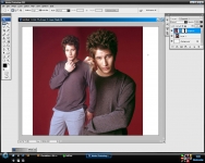
    As you can see this provides a more precise way of deleting unwanted areas, I use this method to make images look like they are the same image (photo manipulation) I find it easier to use this one when I know the specific areas I want to get rid of rather than a general blend.